Context
Dragon Shield provides digital tools for trading card game players. The Card Manager app helps users scan and manage their TCG collections across games like Magic: The Gathering, Pokémon, Yu-Gi-Oh!, and Flesh and Blood.
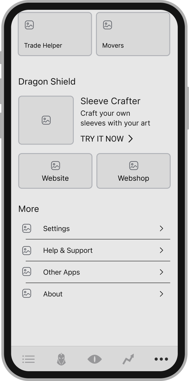
While the app was functionally solid, its main menu lacked personality and did not reflect the dynamic nature of the TCG ecosystem. This created a gap between brand identity and user experience.
Project Focus
Transform the main app menu from a generic settings-style interface into a more engaging, game-centric experience aligned with Dragon Shield's brand identity.
Problem Statement
The existing app menu presented several issues that diminished the overall user experience.
Key Issues
- Generic Settings Layout: The menu felt like a standard settings screen rather than a gaming app
- Limited Visual Engagement: Minimal use of imagery and brand elements
- Lack of Personalization: No connection to user's collection or gaming preferences
- Weak Brand Connection: Didn't reflect the game-centric nature of the product
"The menu feels functional but uninspiring. It doesn't capture the excitement of managing my card collection."
— User Feedback
Impact
As a result, the menu felt functional but uninspiring, creating a disconnect between the app's purpose and its presentation. Users expected a more immersive experience that reflected their passion for TCGs.
Project Goals
Design Goals
- Improve clarity and navigation of the main app menu
- Strengthen alignment with Dragon Shield's brand identity
- Introduce a more engaging and game-oriented visual language
- Validate design decisions through user feedback
User Experience Goals
- Create a more immersive and game-centric experience
- Reduce cognitive load through clear visual hierarchy
- Ensure easy access to core features
- Maintain consistency with the overall app ecosystem
Design Process
Design Direction
The redesign aimed to move away from a generic settings interface and toward a more expressive and immersive menu experience that reflects the passion TCG players have for their collections.
Key Principles:
- Clear visual hierarchy for easy scanning
- Increased vibrancy without sacrificing readability
- Easy access to core features
- Consistency with the overall app ecosystem
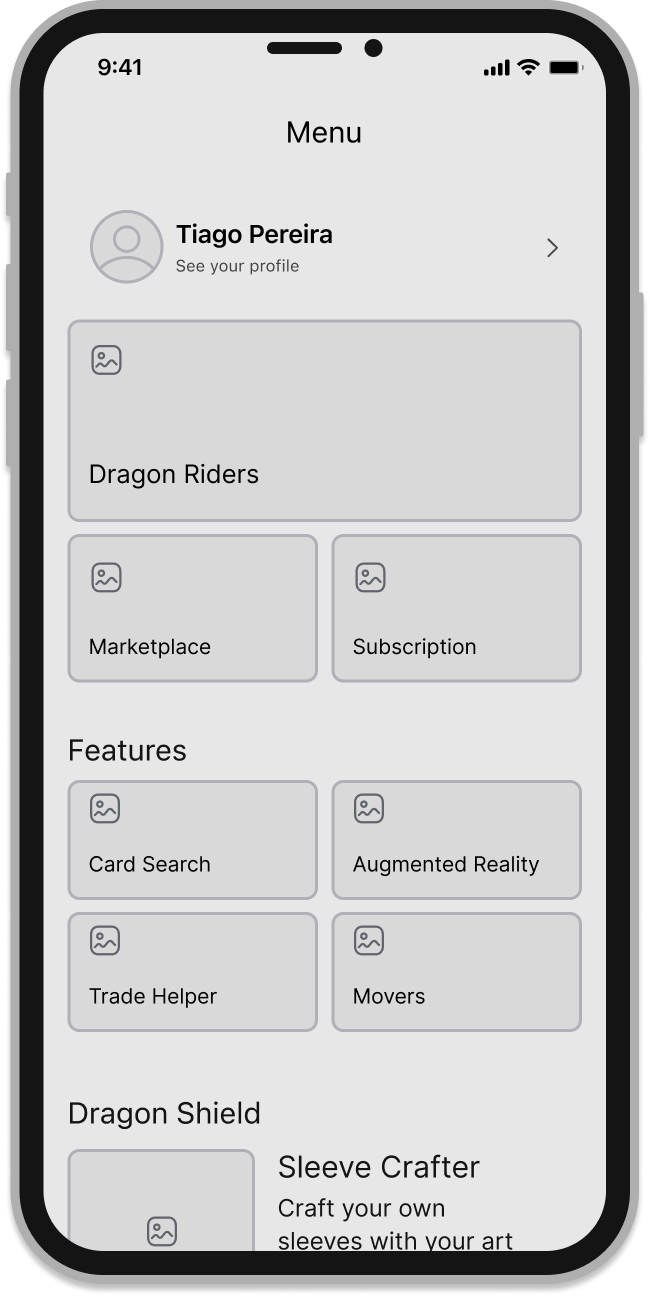
Wireframes
Low-fidelity wireframes were created to explore layout structure and navigation clarity before applying visual styling. The focus was on reducing cognitive load, improving scanability, and ensuring intuitive orientation within the menu.
Navigation Structure
Final Structure
UI Exploration
Two high-fidelity versions of the app menu were designed. Both versions shared the same bottom navigation, while exploring different color distributions and visual emphasis in the main content area. The goal was to evaluate readability, visual balance, and brand alignment.
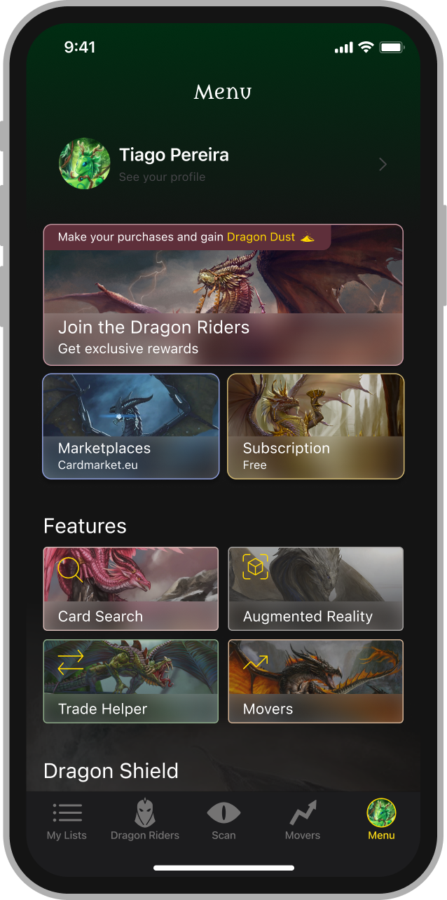
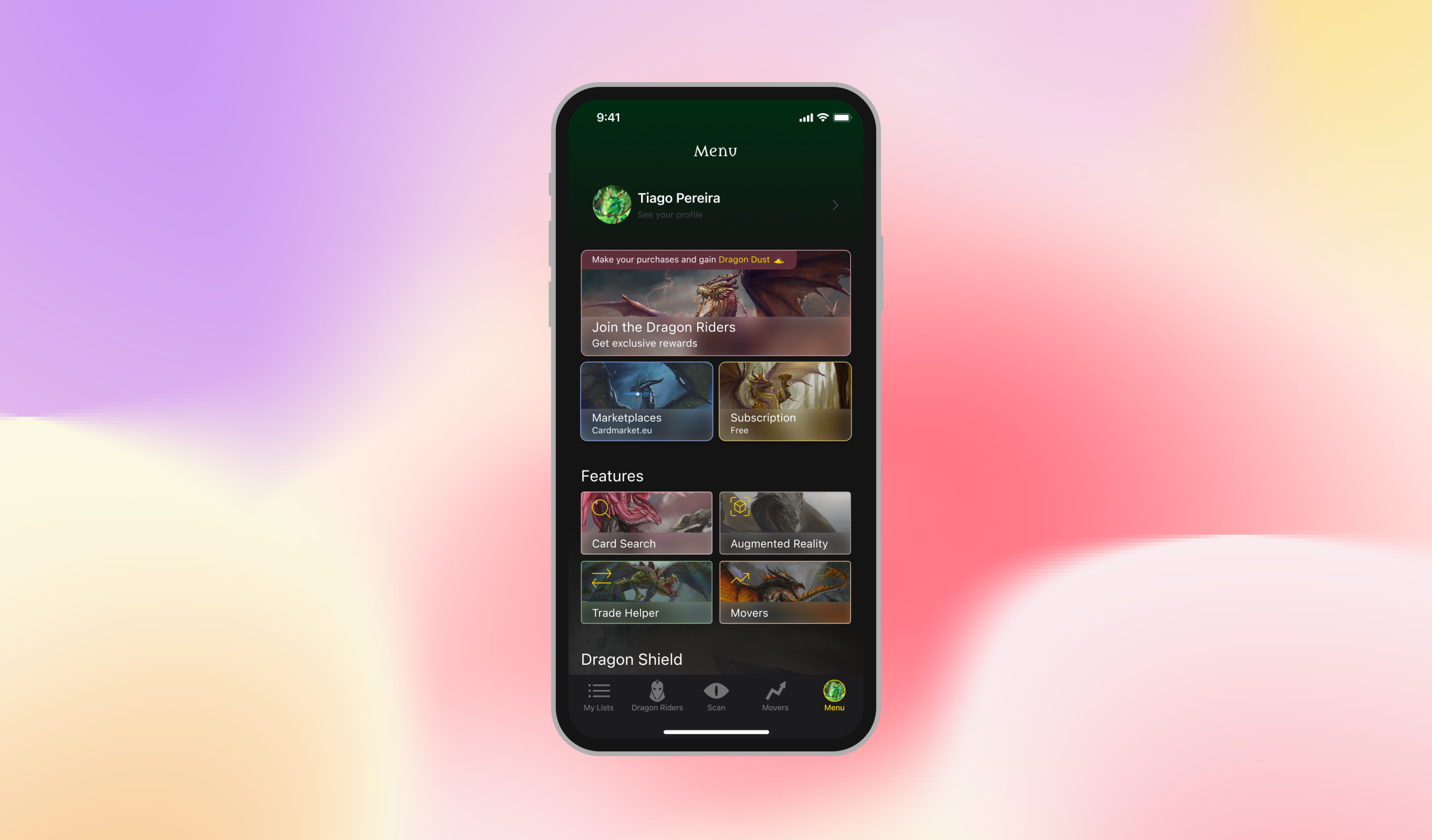
Vibrant Approach
Bold colors and high visual emphasis on menu items. More expressive but potentially overwhelming for frequent use.
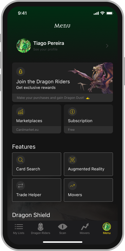
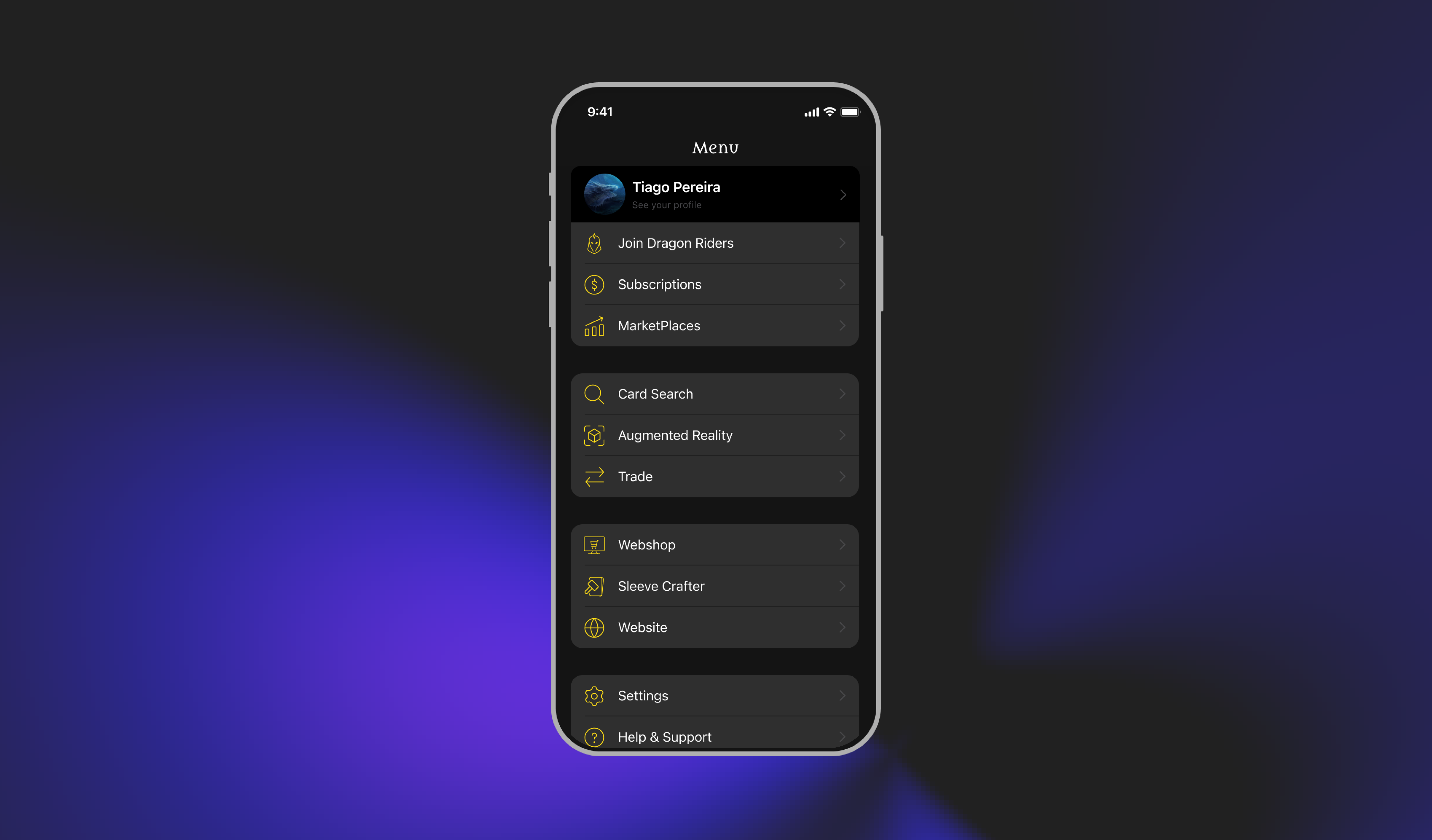
Refined Approach
Simpler visual hierarchy with restrained colors. Better readability and clearer navigation while maintaining brand character.
Design Considerations
Version A Strengths
- • High visual impact
- • Strong brand presence
- • Engaging first impression
Version B Strengths
- • Better readability
- • Clearer navigation
- • Reduced visual noise
User Validation
Survey Methodology
A user survey was conducted using SurveyHero to validate the design direction. Participants were recruited from Dragon Shield's existing user base.
Survey Structure
- Select preferred design version
- Rate clarity and navigation
- Share qualitative feedback
- Suggest improvements
Key Findings
Preferred Version B
Refined approach
Clarity Rating
For Version B
Positive Feedback
On navigation
"Version B feels more professional and easier to navigate. I can find what I need quickly without being distracted."
— Survey Participant
"The cleaner design makes the app feel more premium. It matches the quality of Dragon Shield products."
— Survey Participant
Outcome
Selected Design
The version with a simpler and more restrained visual hierarchy (Version B) was selected based on user feedback and validation results.
Key Reasons
- Improved readability
- Clearer navigation
- Better integration with overall app aesthetic
- Reduced visual noise while maintaining brand character
Design Impact
Enhanced Clarity
Improved scannability of menu
Brand Alignment
Stronger Dragon Shield identity
User Engagement
More engaging first interaction
Validated Design
User-backed decisions
Key Learnings
1User Involvement Strengthens Design Confidence
Involving users in the decision-making process through surveys not only validated the design direction but also built trust and confidence in the final solution.
2Visual Expressiveness Must Balance with Usability
While bold visuals can create impact, they must not compromise readability and navigation. Users consistently preferred clarity over visual complexity.
3Simplicity Often Outperforms Visual Complexity
The more restrained design approach proved more effective for daily use. Simplicity doesn't mean boring—it means purposeful and clear.
4Iterative Feedback is Essential
Testing multiple versions and gathering feedback early prevented costly revisions later. Navigation-heavy interfaces benefit greatly from iterative validation.
5Small Changes Can Have Big Impact
A focused redesign of a single interface element significantly improved perceived quality and usability. Not every project needs a complete overhaul.
6Brand Alignment Matters
Ensuring the menu reflected Dragon Shield's premium brand identity was as important as functional improvements. Design must serve both user needs and brand goals.
Focused Design, Meaningful Impact
This project highlights how a focused redesign of a single interface element can significantly improve perceived quality and usability. By combining UX structure, visual exploration, and survey-based validation, the redesigned app menu delivers a clearer, more engaging, and brand-aligned experience for TCG players.