Context
The business goal was to introduce an electricity comparison vertical to complement existing comparison products (e.g., loans, insurance, credit cards). The challenge was building a brand-new journey that could guide users from data input to a final choice while meeting Finnish market regulations.
This wasn't a redesign—it was a new vertical built from scratch, requiring careful consideration of user needs, market complexity, and regulatory compliance.
Problem Statement
Electricity plans are hard to compare due to:
- Complex pricing models and contract terminology (fixed vs variable)
- Too many similar offers with unclear differences
- Low trust in what's being shown
Users want to feel in control, but information overload and unclear comparisons often lead to decision fatigue and early abandonment.
Success Criteria
Reduce Information Overload
During results browsing, present only essential information upfront with progressive disclosure for details
Improve Comprehension
Make contract terms clear and understandable, especially fixed vs variable pricing models
Increase Confidence & Trust
Build user confidence through trust signals, transparency, and clear reassurance elements
Support Fast Decision-Making
Provide filters, sorting, and structured offer cards to help users compare and decide quickly
Four-Step Journey
A transparent, guided flow designed to educate users while reducing complexity.
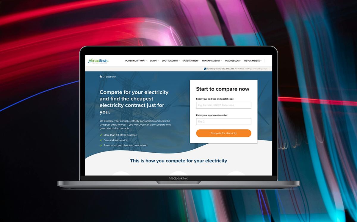
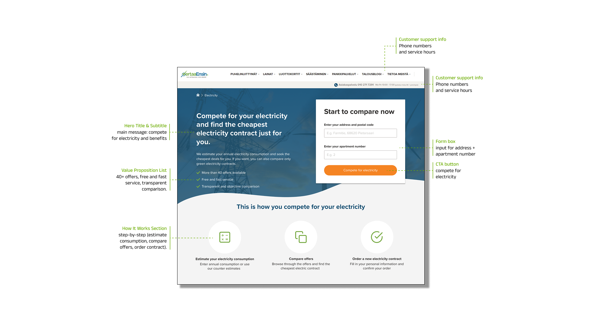
Landing Page
- Address input in the hero section
- Trust elements (badges, reassurance)
- "How it works" explainer to set expectations
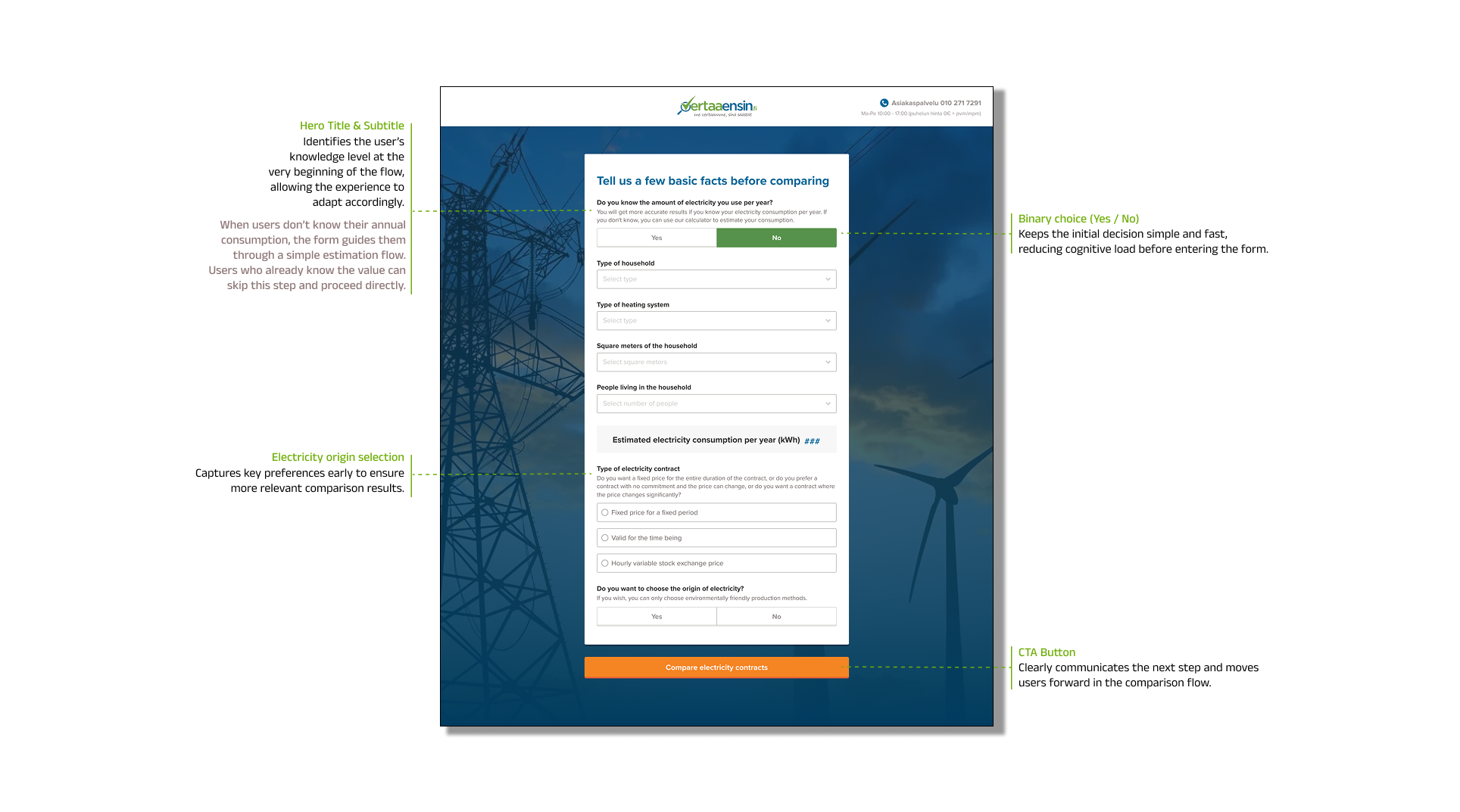
Form Page
- Simple electricity usage calculator for annual consumption estimation
- Adaptive path for users who know vs don't know their consumption
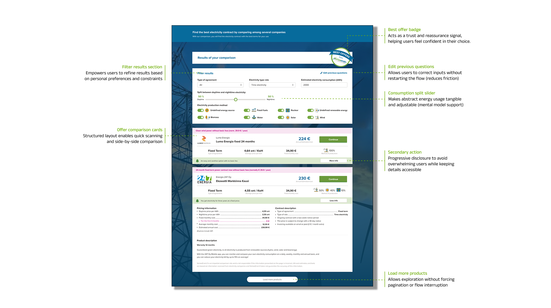
Results Page
- Structured offer listings
- Filters, sorting, and comparison tools to support decision-making
- Progressive disclosure to keep details available but not overwhelming
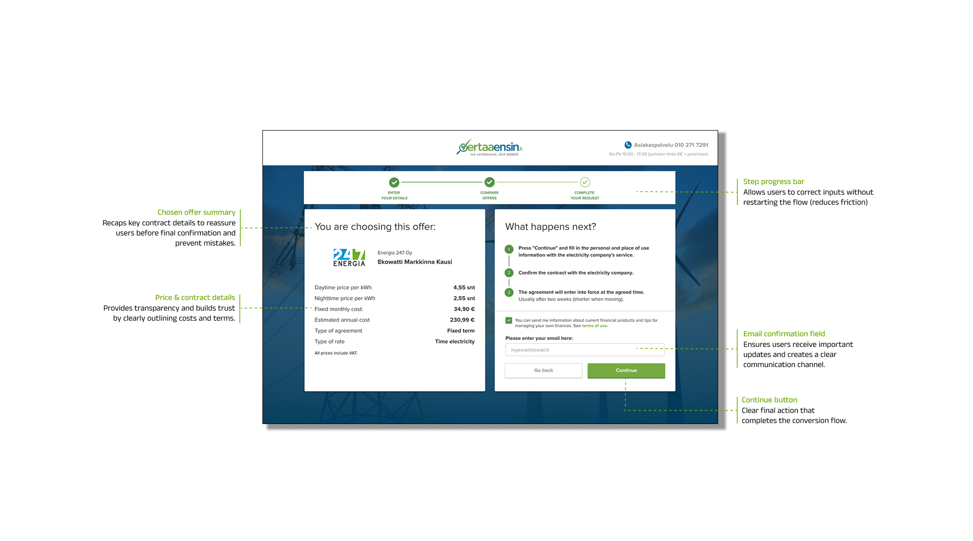
Confirmation Page
- Clear summary of the selected offer
- Final CTA redirecting to the provider's website
Target Audience
Price-Conscious Users
Finnish residents actively comparing electricity providers to find cost-effective deals
Eco-Conscious Users
Users interested in green energy plans and sustainable electricity options
Moderate Digital Skills
Users comfortable with digital tools but with low contract literacy
Household Decision-Makers
Individuals managing household expenses and utility contracts
Research
Qualitative Research (Interviews)
We explored:
- What users look for when comparing electricity plans
- What builds trust in a provider and in the comparison tool
- What helps users feel confident selecting an offer
Key Insights
- Users want control but lack confidence because comparisons feel unclear
- Contract terminology is confusing (fixed vs variable)
- Visual overload discourages engagement and causes early drop-off
- Trust indicators (badges/ratings) were highly requested
Quantitative Research (Survey, n=50)
The survey validated pain points in the original comparison experience:
Felt overwhelmed by the number of offers
Found it difficult to compare plans
Didn't understand fixed vs variable terms
Trusted the offers displayed
Would recommend the comparison page
Personas

Jari
The Practical Planner
41 · Logistics Manager · Tampere · Married, 2 kids
Jari carefully manages household expenses. He's comfortable using digital tools, but electricity offers feel unnecessarily complicated. He wants a fast, reliable way to find the best value without reading fine print.
Goals
- Quickly find the best deal for his home
- Reduce monthly electricity costs
- Save time and avoid uncertainty
Needs
- A clean layout that highlights only essential information
- Filters for contract type and green energy
- A clear "best value" signal to decide faster
Frustrations
- Doesn't understand complex contract language
- Too many offers that look similar
- No clear way to compare what's actually best
"I just want the best deal without wasting time."

Elina
The Values-Driven Chooser
29 · Freelance Designer · Helsinki · Environmental Studies
Elina recently moved into her first solo apartment. She's willing to pay slightly more for an eco-friendly plan, but she struggles to verify which offers are truly green. She wants clarity, honesty, and reassurance before committing.
Goals
- Choose a sustainable provider aligned with her values
- Understand what she's signing up for
- Feel confident she won't regret her choice
Needs
- Clear green energy labeling and verification
- Honest, transparent comparisons
- Trustworthy reassurance elements
Frustrations
- Can't verify which offers are truly eco-friendly
- Greenwashing makes her skeptical
- Lacks confidence in making the right choice
"I want to support green energy, but I need to know it's real."
Wireframes and UI Design
Low- and mid-fidelity wireframes were used to validate structure, hierarchy, and content prioritization before moving into visual design. Early feedback helped refine form logic, reduce friction, and improve scanability.
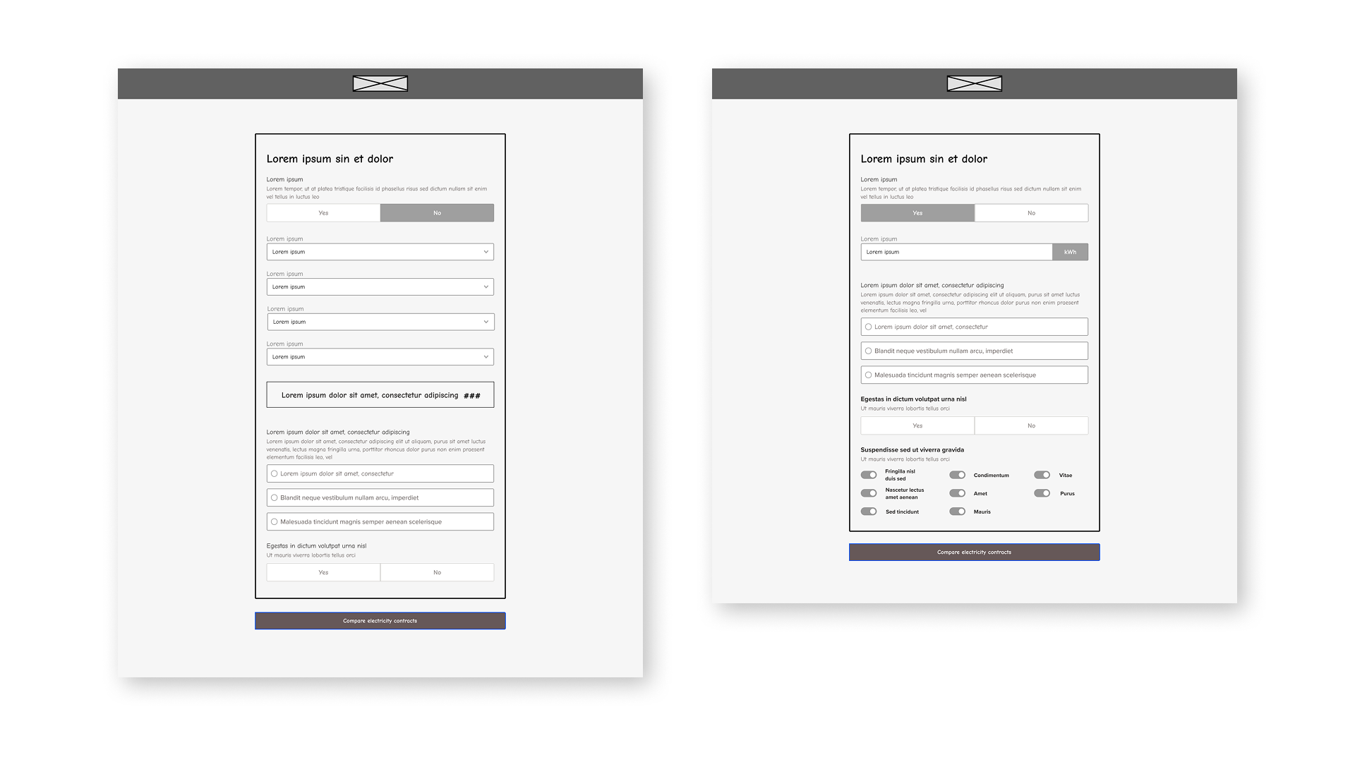
Early wireframes focusing on information hierarchy and progressive disclosure
Landing Page
Form page
Results Page
Final Offer
Applied UI Design
The final interface translates research insights into a calm, structured comparison experience.
Progressive Disclosure
Reduce cognitive load by showing essential information first, with detailed breakdowns available on demand. Users can expand offer cards to see full contract details only when needed.
Filter and Sorting Tools
Support different comparison strategies with flexible filtering (contract type, green energy, price range) and sorting options (best value, lowest price, highest rating).
Clear Pricing Breakdowns
Transparent contract summaries that help users understand exactly what they're comparing. Fixed vs variable pricing is clearly labeled with explanatory tooltips.
Trust Badges and Reassurance
Build confidence through clear trust signals: verified provider badges, customer ratings, green energy certifications, and transparent pricing guarantees.
Usability Testing
Method
Task-based testing on an interactive prototype. Users completed predefined comparison tasks to validate the flow and interface clarity.
Goal
Validate whether users could understand the interface and complete the main flow independently without guidance or confusion.
Outcome
Users successfully compared offers, identified suitable plans, and completed the flow, confirming the information hierarchy was clear.
Key Findings
Clear Information Hierarchy
Users immediately understood which information was most important and how to navigate between offers
Effective Progressive Disclosure
Users appreciated having details available without feeling overwhelmed by information upfront
Increased Confidence
Transparent information and trust signals helped users feel confident in their electricity provider selections
Successful Task Completion
All participants completed the comparison and selection flow without assistance or confusion
Key Takeaways
End-to-End Comparison Flow
Designed a complete four-step journey from scratch, focused on clarity and decision support throughout the entire user experience
Reduced Cognitive Load
Through structured layouts and progressive disclosure, users can process information at their own pace without feeling overwhelmed
Improved User Confidence
Transparent information and trust signals helped users feel confident in their electricity provider selections
Scalable Foundation
Created a reusable comparison framework that can be adapted for future verticals (insurance, loans, etc.)